Canada Life
Product · iOS · Android
Building a Mobile App from 0 → 1
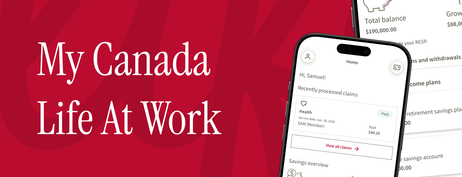
Creating the foundations for a mobile experience used by millions of Canadians.
Role
Lead Product Designer
Timeline
2021–2023
Platform
iOS & Android
Team
Product, Engineering, Accessibility, Research, Design Systems, Marketing
Contribution
Mobile strategy, information architecture, design system foundations, UX process, research collaboration, launch readiness
Canada Life already had a mobile app, but it was time for a rebuild. This redesign was part of a larger replatform initiative spanning both web and mobile, meant to set a new bar for the member experience and give the team room to grow the product for years to come.
As the only senior designer shaping the initial direction, I worked alongside the design systems team to rebuild the information architecture, core experiences, and design foundations from the ground up. Those early decisions are still what the team builds on today.
Early research into what members valued most from their group insurance provider surfaced three design values, Simplicity, Convenience, and Speed. We adopted these values on the mobile team. Simplicity meant a member could navigate intuitively, finish a task without friction, and understand what they were looking at without extra thought. Convenience meant putting the phone's native capabilities to work, biometric sign-in, wallet access, a camera for claims. Speed meant respecting member's time, whether that was faster load times or letting a member resubmit a claim similar to one they'd made before.
The Challenge
Designing for a scale I hadn't designed for before.
This wasn't a redesign so much as a rebuild, and I hadn't worked on a mobile product at this scale before. This app was going to reach millions of Canadians, and that changes how you approach almost every decision, from navigation down to how much you can afford to guess versus validate.
- —Set an information architecture that could grow with the product
- —Build accessibility in from the start, working directly with an accessibility expert
- —Design a UX process that actually fit inside an agile workflow
- —Learn to work fluently with both iOS and Android developers
- —Coordinate with an offshore development team across time zones and priorities
- —Ship a baseline MVP that gave the team room to build more complex features later
App Design & Navigation
Getting the structure right before anything else.
As the only senior designer driving the app's initial direction, I worked closely with the design systems team to define the patterns, structure, and principles it launched with, then spent real time navigation testing those decisions with actual members before they became permanent fixtures of the app:
- —Information architecture
- —Navigation strategy
- —Mobile design principles
- —Early design system foundations
- —Accessibility standards
- —UX process within an agile workflow
- —Launch planning and coordination
Most of those foundational decisions are still what the team builds on today.
Top Nav
Bottom Nav
Persistent
Profile
- Account & bank details
- Security & communication preferences
- Sign out
Benefit Card
- Plan card
- Pharmacy card
- Travel assist
- Add to Apple & Google Wallet
Home
- Recently processed claims
- Portfolio overview
Benefits
- Claims history
- Coverage & balances
- Plan details
- Dependant info
Savings
- Plan balances
- Rate of return
- Fund info
- Add or move money
- Certificate details
- Beneficiaries info
More
- Contact us
- Resources
- In-app passive feedback
Design Principles
Grounding decisions in research, not opinion.
I worked closely with research to establish the design principles the app would be built around, validating navigation, information architecture, and specific experiences before they got locked in. That included a competitive study of how other Canadian and US benefits and finance apps solved similar problems, which shaped what we borrowed, what we deliberately avoided, and where we had room to differentiate. At this scale, a wrong assumption is expensive to unwind later, so research helped us catch that early instead of after launch.
Accessibility
Building accessibility in, not bolting it on.
Given how many people would eventually use this app, accessibility couldn't be an afterthought. I worked directly with an accessibility expert to make it part of the process from the start, not a review that happened right before ship.
Designing for Two Platforms
Learning to speak both platforms.
Working closely with both iOS and Android developers meant learning to talk their language: platform conventions, technical constraints, native patterns, well enough to design with them instead of throwing screens over the wall. It made for a much better working relationship with engineering.
Comparing how the same interaction behaved differently across both platforms directly informed a new design system built specifically for this app, one that respected each platform's native conventions instead of forcing a single visual language onto both. A plan selector is a simple example: iOS members expect a bottom sheet with explicit Cancel and Done actions, Android members expect a dialog with radio selections and its own Cancel and OK.
iOS: action sheet
Android: dialog
Select Plan
Aligning Multiple Teams
Communicating a vision across teams and time zones.
Part of this project involved working with an offshore development team, which came with its own set of challenges, mainly making sure the vision behind our decisions actually came through clearly and not just the decisions themselves. Getting that alignment right across internal teams and an external partner took as much communication as it did design.
Spotlight
Apple Wallet & Google Wallet integration
One of our clients wanted a very specific experience for their benefit cards inside the app, and it didn't line up neatly with our technical setup. Instead of going back and forth over email, I got on a call directly with their team and workshopped it with them, balancing what was technically possible against what they actually needed on the business side.
We landed on a solution both sides were genuinely happy with, for the Apple Wallet and Google Wallet passes.
Listening After Launch
Building a feedback loop that actually got used.
Shipping the app was never going to be the finish line. I worked with the Qualtrics platform to build an active, in-app feedback module that asked members the right question at the right moment, right after they finished submitting a claim, for example, instead of a generic survey interrupting them at a random point in their session. That context was the difference between a prompt people dismissed and one people actually answered.
Those responses fed into a UX Qualtrics dashboard the team used to sort and triage issues, turning scattered feedback into something we could actually prioritize against the roadmap instead of anecdotes floating around in separate inboxes.
Launching a Product
Taking the initiative on launch.
As we got close to launch, I took the initiative to figure out what actually needed to happen to get the app out the door. That meant working with the motion and visual design teams on the launch experience, SEO and marketing on how the app would be found, engineering on assets for the Apple App Store, Google Play, and the iPad App Store, and content writers on release notes that actually sounded like they were written for a person. A lot of it was just coordination: making sure the right people had what they needed at the right time.
Outcome
A foundation the team still builds on.
This was a baseline MVP, so it's hard to point to one single feature as the highlight. What I found genuinely exciting was the challenge underneath all of it: how do you rebuild something at scale and actually make it better? The strategy and principles I set at the start are still what the team uses today as they build more complex features and make the app more feature rich, and usage has kept climbing steadily since launch.
#1
Top Finance app on the Apple App Store, November 2024, up from where the previous app ranked.
50K+
app visits every day, and still growing.
App Store reviews have also improved compared to the previous app, though there's still work to do. A good part of the app still relies on web views rather than fully native screens, and that's something the UX team is actively working to change. It's a slow, steady process, but the improvements are showing.
Reflection
This project taught me what it actually means to design for scale before scale exists. There wasn't much room to guess, and the existing app wasn't something you could just polish. It needed to be rebuilt, and that came with the responsibility of getting the foundation right. The most valuable thing I did wasn't any single screen. It was the structure and decisions that let the app keep growing long after I handed it off.